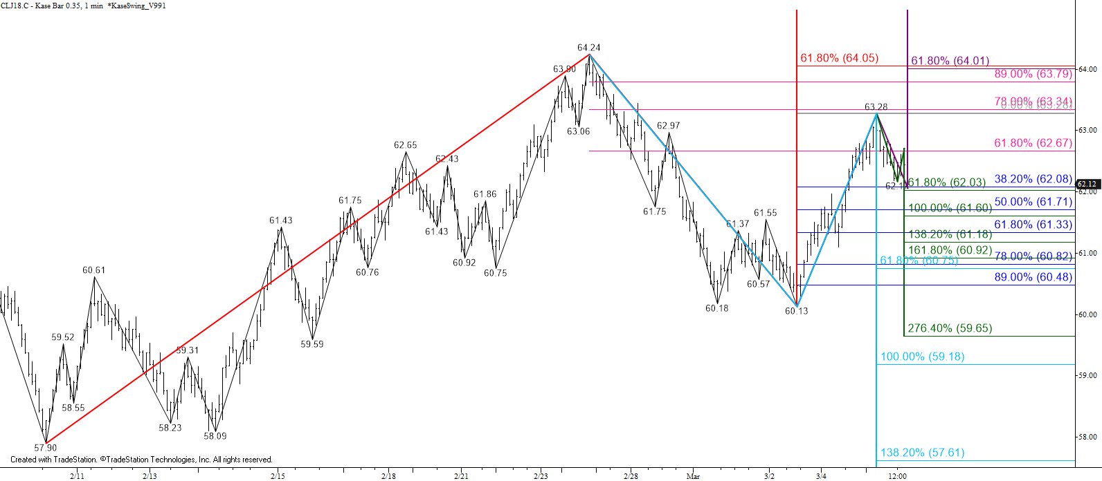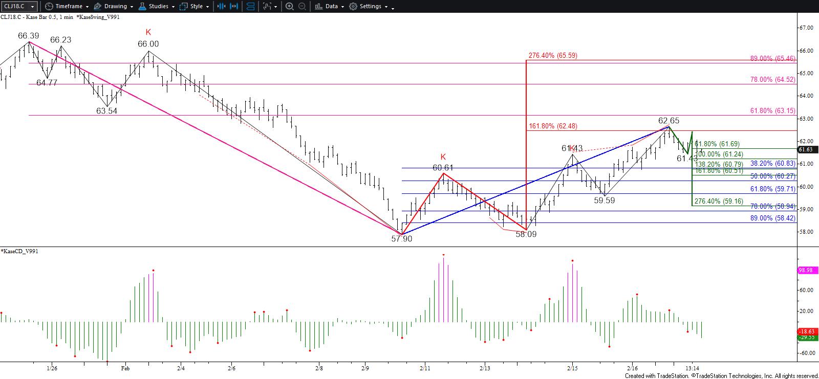
May WTI crude oil fulfilled a highly confluent and extremely important target at $64.0 today when price rose to $63.98. The move up comes after prices broke higher out of the bullish descending flat wedge Friday and then tested and held the pattern’s upper trend line Monday. As discussed in our weekly forecast, $64.0 is the gateway to a stronger and possibly longer-term bullish outlook. A sustained close above $64.0 will open the way for the next major objective at $66.4, with intermediate targets of $64.8 and $65.4 between.
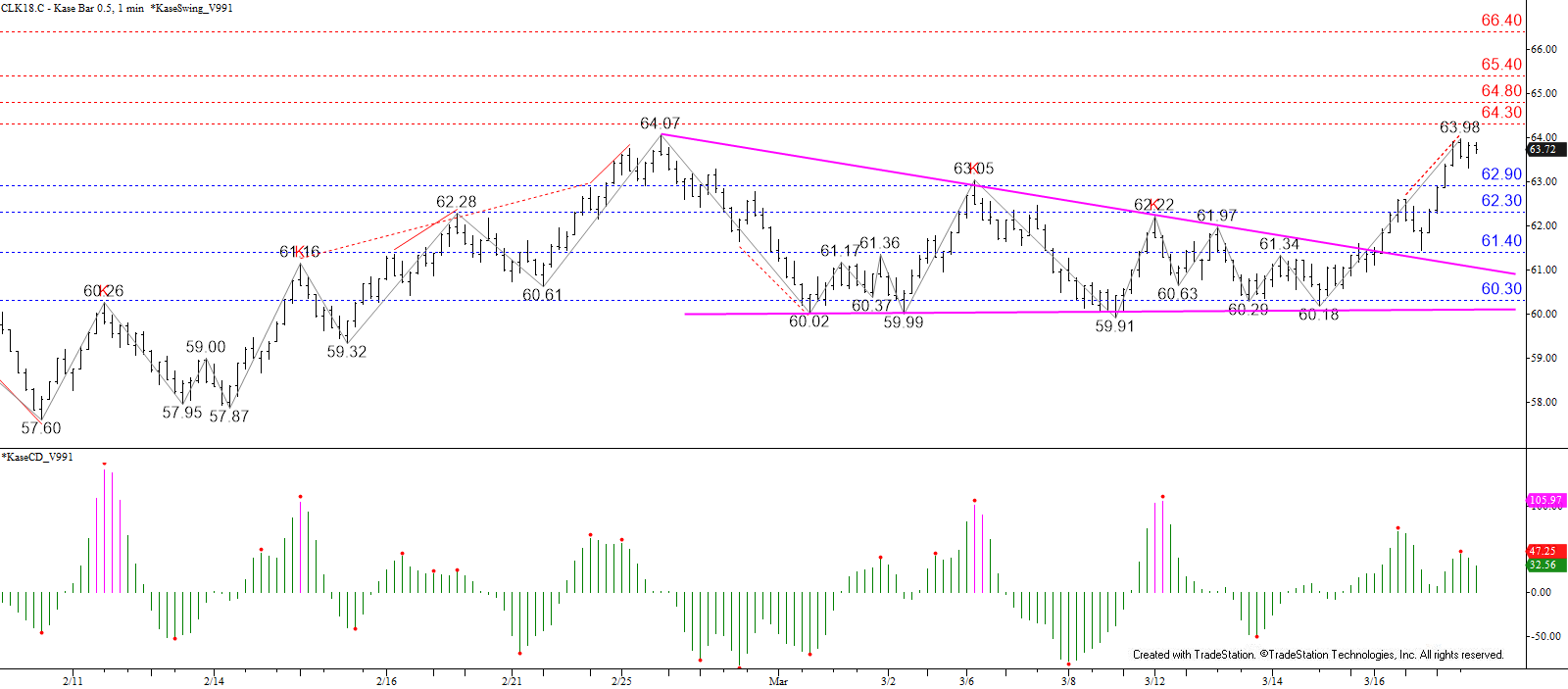
Crude oil prices pulled back a bit from $63.98 and confirmed a weak bearish KaseCD divergence on the $0.50 Kase Bar chart. This, and the small wave down from $63.98, indicate there is a modest chance for a larger pullback tomorrow. Initial support is $62.9 and key support for tomorrow is $62.3. A close below $62.3 would call for a larger correction to $61.4, which is most important because a close below this would be an early indication that the move up may have stalled again. That said, the outlook does not become solidly negative until there is a sustained close below at least $60.3.
This is a brief analysis for the next day or so. Our weekly Crude Oil Forecast and daily updates are much more detailed and thorough energy price forecasts that cover WTI, Brent, RBOB Gasoline, Diesel, and spreads. If you are interested in learning more, please sign up for a complimentary four-week trial.