5 Steps to Getting Investment Risk Under Control

Photo credit: Lendingmemoby Cynthia A. Kase

Read on FEI Daily

Without investment risk none of us would make any money in the markets, but managing trading risk as a financial executive is a lot more complicated than one might like.
Often risk limits are set arbitrarily and  impacted by trader performance, units traded, the typical risk per trade, and whether the risk per trade is statistically appropriate.  If the risk is too low, that means you constantly see your stops hit and exceed your limits, only for the market to turn back in your favor. If the risk is too high, you will stay in losing positions too long, and give up too much on profitable exits.
Proper stops cannot be placed purely on one’s comfort level, or budget, but are dictated by market conditions and volatility.
STEP 1: Understanding Trader Performance Risk and Percent Chance of Loss
Everything else being equal, a trader with a good track record has a lower probability of losing the risk limit than a trader with a poor one.
Corporate traders are often inexperienced, as I was when I was transferred into international energy trading from engineering in 1983 (just as the crude oil contract was introduced). So it’s not always a valid assumption professional traders are competent or well-trained. Back then, energy traders only used fundamentals (defined as research combined with speculation), and setting risk limits as a gross value made sense. The best computing power we had on the trading floor was an Intel 8086 beige-box desktop, and streaming data evaluation — available on today’s Bloomberg terminals — was not within reach.
Many years later, computing power can push lots of streaming data through very sophisticated algorithms evaluating risk in portfolios, even if they contain thousands of securities, in the blink of an eye. Thus we can set risk limits and control risk in a much more granular and nuanced way. It’s not a question of either fundamentals or technicals. Today, there’s no excuse not to do both.
This first step involves understanding the math that underlies basic risk calculations, and how they are impacted by trader performance. Here are the key formulae, derived from game theory.
A =     RL / {In(P) / [ln(1 – W) – ln(W * R)]}
RL =     A * {ln(P) / [ln(1 – W) – ln(W * R)]}
P =     EXP ({RL * [ln(1 – W) – ln(W * R)]}/A)
Where:
A =     Amount of Risk per Trade
RL =     Risk Limit, or Total Capital
Willing to Lose
P =     Percent Chance of Losing RL
W =     Percentage of Time “Win”
R =     Win-to-Loss RatioLet’s assume the risk limit is $100,000. The trader will be “shut down” if that much is lost. However, there’s a big difference between a 25 percent chance of losing $100,000, versus a more tolerable 0.25 percent.
The question becomes how much of a chance is being taken of losing “everything”. W is the percent of times a profit is made. So if 100 trades are taken and 55 are winners, the W value is 55 percent, or 0.55. R is the ratio of the average wins, say $10,000, and the average losses, say $5,000, with R, then the win to loss ratio equal to 2.0.
Using various inputs with a range of P values produces the following:
The table shows risk-of-ruin can be by cut by a factor of 10 but cutting the risk per trade by half. Dropping from 1 percent risk to only 0.25 percent, a 75 percent further reduction, only takes a 24 percent cut. So, cutting the amount risked per trade has outsized payouts relative to the probability that the RL will be lost. Also cutting risk per trade by about one-third would allow a more conservative assumption of W = 1.5:1 for untried traders.
With a percentage of winning trades of 40 percent, the win-to-loss ratio would have to rise to 3.67 for the same results. Many pundits point out that it’s possible to have a winning track record with less than 50 percent wins. The problem is that this scenario usually relies on outlier wins, as opposed to steady wins in the 3.5 to 4.0 range. Since outliers are, by definition, not typical, one must be wary of such assumptions.
Kase has developed more complex Monte Carlo models to simulate outliers in wins and losses, and the percent of wins for a more nuanced view, and to track trader performance against statistical expectations. However, plugging the formulae above into a spreadsheet is a good place to start.
Step 2: Measuring Risk
Step Two involves translating risk per trade into risk per unit and units per trade in a non-arbitrary fashion.
The risk per unit is the point at which a stop would be placed. It’s necessary to assess the degree of risk inherent in a given market, and design a stop suitable for it. Being ex-Navy, I like to use a nautical analogy. Sailors must evaluate conditions, such as the height of the waves, wind speed, direction, and the like. You risk ruin choosing to sail a dinghy in a raging Atlantic storm, because its price is consistent with your budget.
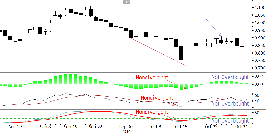
The primary measure of trading risk is True Range (usually written TrueRange), and it is this value that should be the basis of setting stops. TrueRange is proportional to local volatility. TrueRange = maximum(H, C[1]) – minimum(L, C[1]). This is similar to a bar’s high low range, but includes gaps between the previous bar’s close and the current bar’s high or low. Chart 1 below shows a TrueRange (red) and High-Low range (blue) as identical. The middle chart shows the low of the TrueRange at the previous day’s close, below the low, and to the right also at the previous day’s close, above the high.
Nomenclature is H = high, L = low, C = close, and [n] = bars back. This bar is always bar[0], though it’s customary to drop [0], as it’s understood.
TrueRange may be calculated over multiple bar lengths, such as sets of three bars.
STEP 3: The Amount of Risk per Unit, or Setting Stops
Simple stops might be based on a multiple of Average True Range (ATR). Typically a value of around 1.7 would be considered a warning, or even an exit if broken on a closing basis, and a multiple of 3 to 4 works for a must-exit point. Depending on your exit strategy a stop using a multiple between 1.7 and 4 should be used to determine the risk per unit.
ATR is available in most, if not all, charting platforms, but if yours doesn’t have it, it’s easy to calculate on a spreadsheet.
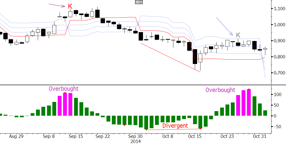
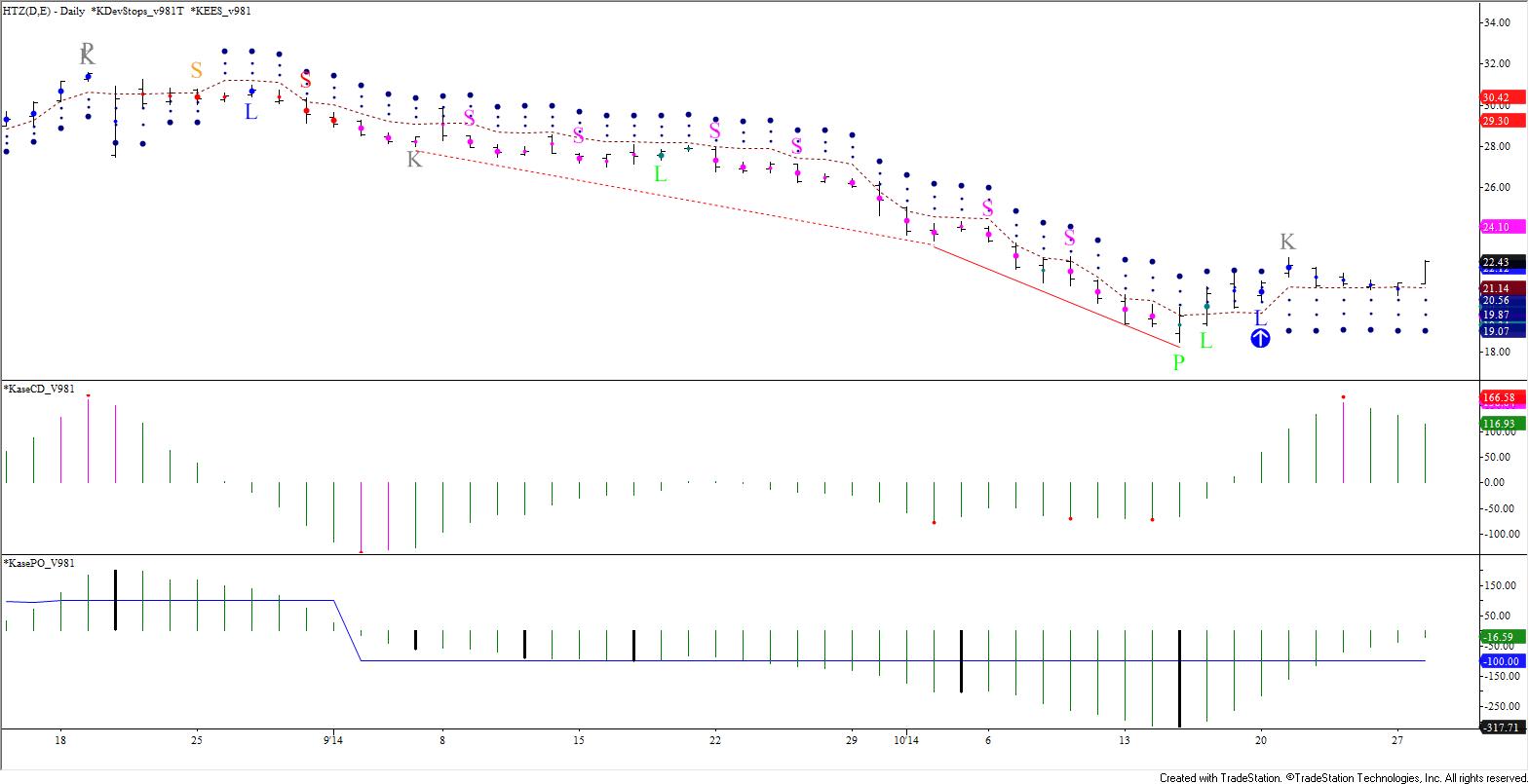
Because the standard deviation of True Range varies, Kase developed an improved stop called the DevStop. It uses multiple standard deviations over the mean TrueRange based on two-bar sets, corrected for right-hand skew. Using two-bar calculations helps capture some directional information on whether bars are overlapping due to oscillations or moving directionally. Because these stops are statistical, a setting of 1.0 standard deviations over-the-mean captures about 84 percent of the observation on a cumulative basis.
Chart 2 below shows the ATR stops in the top pane and DevStops in the lower, both based on 30 periods. The placement of the stops on the chart is driven by a 10- and 21-period simple moving average. When the 10-period moving average is below the 21-period moving average, the stops “trail” the lowest low, to which they are added, and vice versa.
STEP 4: As Time Frame Rises, Risk Rises on a Diminishing Rate.
Even though you might be looking at a daily chart, weekly charts are often preferable, and sometimes even monthly, as the oscillations in many, if not most, securities are statistically too large to manage on a daily basis. Remember the market doesn’t care about your budget. If the market dictates a monthly chart, so it is. The key is to know how large your stop must be and set your other risk limits accordingly. Keep your risk profile at the same or a lower level by adjusting units traded.
By doing this, keeping risk the same, you might actually be improving performance because you will be hitting stops and churning much less often, and price action smoothes out.
A big benefit in moving up in time is that the risk only increases proportionally to the square root of time, and in real life, often less. So moving to a higher time frame has diminishing costs.  Moving up by a factor of 25 only increases risk by 5, and from a daily to a monthly about 4 or so. Again, in actuality the impact of outliers is often felt less by the bigger bars, so the risk increase might be dampened.
The penalty is on the downside. If you want to cut the risk inherent on a daily chart by a factor of 3, you need to trade 9 bars per day. Dropping down to a lower time frame, where an oscillation on a daily bar becomes a trend on an intraday is an option, but with diminishing value. The impact of outliers and gaps hits harder. Also this requires active trading that is impractical for moderate to large volumes.
Case Study: AAPL
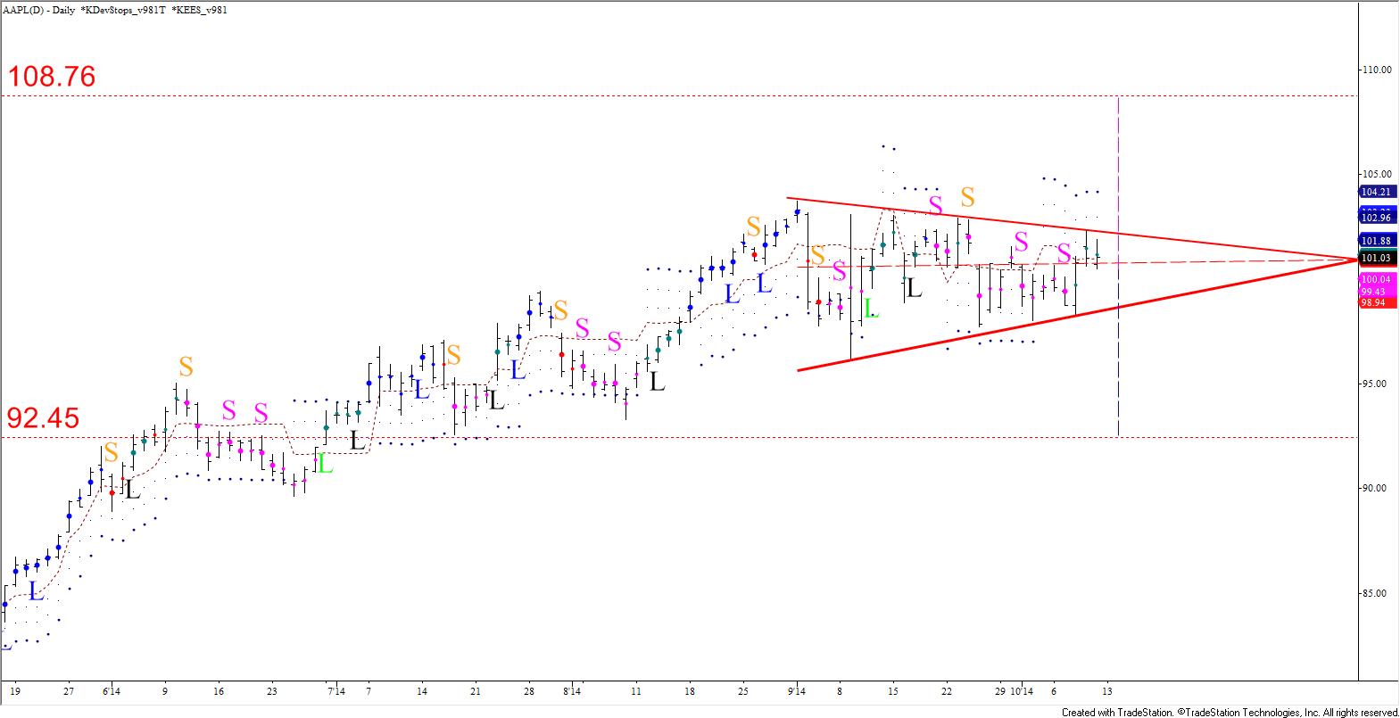
Let’s look at Chart 3 below, two AAPL (Apple Inc.) charts. The one on the left is a daily and on the right a weekly chart. Each shows price activity from about March 2014 to January 15, 2015. Each chart has double-sided DevStops, with a 10 and 21 simple moving average in the bottom pane. Here the “normal” stops, in the direction crossover, are shown in brown. If there’s a “mini trend” in the opposite direction, those are shown in aqua. The reason these mini-trend stops are shown is that sometimes traders reverse positions before the moving averages do, and therefore, traders have asked us for stops in that case.
Looking at the stops changing color and the moving averages crossing back and forth, it’s clear that although AAPL was trending, the daily was choppy. The weekly only had one back-and-forth cross early and then moved up cleanly.
One might argue that it’s only natural for a weekly to have fewer crossovers than a daily, but in this comparison, the daily is quite choppy for a trending market, regardless. (I call this type of market “hybrid” as it is choppy and trending at the same time). Note the moving averages are used to illustrate the point that regardless as one’s choice of system, there would be a fairly high churn on the daily, anyway. I count about 16 moving average crossovers, 12 hits on the first level stop, six of which followed through to hit the second level. Only the early December hit was significant.
On the weekly, price action looks fairly clean, and the first level stop was hit only twice: once during a corrective period in the fall, and then on the week ending December 12, 2014, at which time there was a close below it. Thus the weekly would have allowed the trade to run at least until then. This is not to suggest that the daily be ignored altogether, just that it should not be the primary chart monitored.
Take a closer look at the smallest of the purple values on the right of each chart. The daily’s value is 6.56 and the weekly’s is 10.44. This is the first stop’s risk. If we assume that one would exit on a close below this stop, the daily has eight exits, while the weekly only one, on December 12. However, the risk on the weekly is only 1.6 that of the daily even though the time has increased by a factor of 5, with a predicted increase of 2.23 (√5) or less. As noted above the actual increase is usually less.
The fact that risk of about $10.44 per unit must be taken might be unpleasant. However, if you look at the red arrows, it’s obvious that the statistically based stops inherently match up with highs and lows on the weekly, not the daily. Finally, look at the small number in green between the risk values. This is a gauge of chaotic activity, based on a ratio of standard deviation versus average range measures, called the Kaos ratio. The reading on the daily is 0.39 versus the weekly 0.33, showing that with the lower value, the weekly is probably a better choice.
STEP 5: Crunch the Numbers
You can determine the risk per unit using the simple stop calculation, and put it into the formulae in Step One to figure out how many contracts to trade. The stop also can determine loss triggers at which you will monitor trades and traders more closely.
To cut out the spreadsheets, I’ve designed an algorithm that automatically pulls the largest stop value and does all the calculations. Based on a risk limit of $100,000, win-to-loss of 1.5, wins of 55 percent, and 0.25 percent, 0.50 percent, 1.0 percent, and 2.5 percent risk of ruin (as inputs into the algorithm), the risk per trade and units per trade are returned in the Chart 4.
Comparing (on either chart) the “red” at a 2.5 percent risk of ruin with the “blue” at 0.25, a 10 fold reduction, a decrease of 38 percent, or a factor of 2.6 is required. So modest reductions in trading volume disproportionately diminish risk.
The risk per trade is the same on both charts, as it is driven purely by the manual inputs into the model. The units per trade is the risk per trade divided by the risk per unit (the stop value) pulled from the chart by the algorithm. Here there has been a five-fold increase in the bar length, but the units per trade drop by less than 30 percent.

Simple risk of ruin calculations can be used to determine risk limit parameters. The key is to use TrueRange based stops to gauge the risk per unit. Risk does not increase at the same pace as bar length increases, which is favorable to using longer bar lengths. Reductions in trading volume disproportionately decrease risk. If stops are hit often, try higher bar lengths. With the five steps done correctly, you can use stops to monitor individual trades and traders, as well as performance over time.

Cynthia A. Kase, CMT, MFTA, chemical engineer, oil trader, risk manager, and highly acclaimed market technician, is president of Kase and Company, Inc., CTA which has two foci: advising corporate and institutional energy clients on trading, hedging and risk management issues, and another as a cutting edge software developer of technical forecasting and trading studies, and algorithmic solutions to trading issues. 

Since late 2011 the Korean Stock Exchange (KOSPI) has oscillated in a narrowing range, now nearing its apex, which means a breakout is expected within the next quarter or two, perhaps sooner.

The pattern began after 2011’s decline to 1644.11. The entire pattern could be the middle “B” wave of a downward ABC correction, or, alternatively the first wave of a renewed push higher. This will remain an open question until there’s a break out, but recent technicals call for a test the formation’s upper trend line. So odds may indeed favor a break higher.

KOSPI Monthly
KOSPI Forecast Monthly

The first positive factor is a bullish piercing pattern that formed after a test of the pennant’s lower trend line, when January opened below December’s close and closed above December’s midpoint. If February, now trading slightly over December’s 1971.95 open, closes above that point, the bullish tone will be confirmed.

The next bullish factor for this KOSPI forecast can be seen on the daily chart, in red. This is a five-wave trending pattern that met a major target at 1970.27 (the top of Wave 3), and is now poised to extend to key endpoint targets for Wave 5, at 2039.6. Early in the move up a strong buy signal called a pierced dart (two green up arrows and yellow triangle) triggered on the KaseX trading study.

KOSPI Daily
KOSPI Forecast Daily

Hitting 2039.6 would be extremely important because the KOSPI Index would have overcome the top of Wave B, marked in blue. To be considered complete, waves must extend to at least their 0.618, or smaller than, projection. This value was met at 1876.27. Kase’s studies show that just 13 percent of waves stall at this level, the remainder go on to meet their equal to, or 1.0 projection. Overcoming 1994.82 would wipe out Wave C. At that point, the entire wave down from 2093.08 would have to extend down as a whole. Alternatively the wave would be considered complete at the minimum extension, potentially a bearish technical failure.

A bearish failure often results in a sharp rise. Therefore, overcoming 1994.82 could be the catalyst that the KOSPI Index needs to make a decisive upward move.

2039.6 has about 2/3rds odds to be met, and would likely trigger connections to 2158.2 from the waves up from 1644.11. At that point, the resistance line will have been broken. Waves up from 892.16, which also point to 2158.2, might then extend to higher targets at 2336.2 and 2484.3.

In summary, while KOSPI has been oscillating in a neutral range, 2039.6 is the key for an upside test. There could be a pullback at 2039.6, but a sustained close over this, calls for 2158.2, above the upper trend line. A sustained close over this would confirm a valid break higher and open the way for the 2336.2 and 2484.3 targets.

Learn more about Kase’s trading indicators KaseX and Kase StatWare that were used for this KOSPI forecast.

Take a trial of Kase’s weekly energy forecasts that use the same techniques as this KOSPI forecast.


Kase’s senior analyst Dean Rogers reviews trade setups and price forecasts for e-mini S&P 500, AAPL, and MSFT, using Kase Wave Analysis and Kase StatWare.

http://youtu.be/SZ-ipWldKTc


Kase’s senior analyst Dean Rogers reviews trade setups and price forecasts for e-mini S&P 500, crude oil, natural gas, AAPL, and VIPS using Kase Outlook, Kase StatWare, and KaseX.

http://youtu.be/pLCujMm5-WE

On Oct. 30, a colleague called frantically about 10-year German government bonds taking a major reversal after weak German business confidence data had been released. He was having difficulty gauging the importance of the news, and hoped that technicals would put the talking-head chatter into perspective, something fundamentals alone couldn’t do.

I plotted a daily candlestick chart with the RSI, MACD and Stochastic. GDBR10 had been in a downward oscillating trend for decades, interrupted by prolonged corrections, the latest of which ended in mid-January. The recent run up lasted eight days, so just from a duration standpoint, it wasn’t much of a recovery. Days six and seven formed a bearish Harami line and star. Oct. 27 closed below the midpoint of the Oct. 23 Harami line, indicating that the pattern was complete. So, even without indicators the candles showed a clear bearish pattern.

Candlesticks Showed Bearish Signal Before Other Indicators
image1

However, none of the indicators were either divergent or overbought. This is a key fault of these indicators in that they are “unidirectional” — when they trigger the follow through is good, but they often lack signals ahead of turns.

These common indicators were originally for calculators, not computers. The solution is to use new approaches which employ computationally intense algorithms to optimize for serial dependency, cycle length, and scale for logarithmic volatility. This results in bi-directional indicators and statistically significant stops, such as the KaseCD and Kase DevStops.

The KaseCD goes magenta when it’s overbought or oversold, as on Oct. 27, warning of a possible turn. Anyone long the eight day rally should have become increasingly cautious, especially as the following days were sideways. This would have meant scaling back a long position, or perhaps selling covered calls.

KaseCD Turned Magenta to Signal Overbought Level
image2

Earlier signals missed on the first chart were caught as well. Oct. 16’s turn was clearly signaled by a KCD momentum divergence, as marked by the automatically generated red divergence lines. The mid-September decline was signaled by the KCD overbought “K.”

Cynthia Kase, President
President
Kase and Company, Inc.

For a no-charge trial of Kase StatWare on Bloomberg visit APPS CS:KASE, which includes the KaseCD and Kase DevStops, contact us if you have any questions.

On October 1, 2014, Kase commented on a tweet, and posted the weekly chart shown below, regarding the decline of Hertz (HTZ). In that tweet, we stated that the decline from $31.61 was likely a corrective Wave IV of a long-term bullish five-wave formation. A week later, on October 8, we discussed the trade setup during our weekly chat session (minutes 16:50 – 21:00). At that point, the 38 percent retracement at $22.47 had been taken out, but we stated that for the five-wave formation to remain intact, the top of Wave I ($17.64), which was in line with the 62 percent retracement at $16.84, would need to hold. We also commented that we were watching the daily chart for bullish signals such as completed momentum divergences and oversold signals that would tell us the move down was possibly complete.

Figure 1 – HTZ Weekly as of October 1, 2014
HTZ Weekly 20141001

Fast-forward a few weeks later, and the next chart below shows that the move down stalled at $18.50 on October 15. The $18.50 swing low held the 62 percent retracement and top of Wave I as called for. A recovery has begun to take place, indicating Wave IV is likely complete and Wave V is underway. In addition, Wave IV ended up being a simple correction versus the Wave II correction. If you look closely at the details of Wave II you will see that it broke down into a complex five-wave, or nested three-wave correction. This is called the “rule of alternation”, which indicates one of the corrections will be complex and the other simple when a five-wave pattern is forming.

Figure 2 – HTZ Weekly as of October 28, 2014
HTZ Weekly 20141028

Table 1

Wave III met the intermediate (I, or 1.382) projection of Wave I, $1.55 – 17.64 – 7.80. This formation now has the potential to extend to $33.5 over the course of the longer-term (a few months or more). This is because Wave I projects to $33.5 as the larger than target (L, or 1.618). This is also the smaller than (S, or 0.618) projection for Wave III, $7.80 – 31.61 – 18.5. Most importantly, for this to be a textbook five-wave formation, at least two waves have to be equal. Rising to $33.5 would make Waves I and V nearly equal in size (Wave I = 17.64 – 1.55 = 16.09, Wave V = 33.5 – 18.5 = 15.0). If Waves III and V end up being equal, the move up would extend to $42.3. So over the course of the longer-term, as the probable Wave V extends, we now know that the potential for this move is $33.5 and possibly $42.3.

As we had discussed in our weekly chat session on October 8, once Wave IV was complete, we wanted to drop down to time a long entry on the daily chart. However, we needed to see evidence on the daily chart that the move down was likely complete. When dropping to the daily chart shown below, as of October 28, we can see that a bullish KaseCD divergence (red line) and KasePO PeakOut (green P) were confirmed at the $18.50 swing low, and that two subsequent buy signals (green and blue L) triggered. These are signals from our Kase StatWare indicator package and show that a trader may have established a long trade on the daily chart upon the second L (marked by the blue arrow) on October 20 at approximately $21.39. A stop would be placed at $19.07, which is DevStop3, or approximately 3.6 standard deviations of average True Range (ATR).

Figure 3 – HTZ Daily with Kase StatWare as of October 28, 2014
HTZ Daily 20141028

Traders holding this long position would now monitor the daily chart for exit and warning signals. One such warning signal was triggered by the gray K, which is a weak KCDpeak. Traders may have pulled stops into DevStop2 (second blue dot), and once the accompanying $22.60 swing high is overcome, the stop will be widened back to Dev3 (third, and largest, blue dot).

In addition to monitoring the daily chart, traders could also watch for a confirmed buy signal (L) on the weekly chart. This has not triggered yet, but once a buy signal forms on the weekly chart, a trader could scale the daily trade to the weekly chart, widen stops to DevStop3 on the weekly chart, and then monitor the weekly chart for exit and warning signals. The long signal on the weekly chart will warrant the added risk of holding a trade with wider stops on the weekly chart. This ‘scale up’ technique is useful for holding positions over longer periods of time and avoiding whipsaws. This technique also limits initial trade risk because the standard deviations of ATR (method used for Kase’s DevStops) on the daily chart are smaller than standard deviations of ATR on the weekly chart. Therefore, if the trade does not play out as expected, a trader can get out of the trade sooner on the daily chart, limit losses or preserve any gains, and live to trade another day.

At this point, we can also analyze the recent move up from $18.50 and look for important near-term resistance. When forecasting, we primarily rely upon confluence of Fibonacci wave projections and retracements. For instance, the smaller than (S or 0.618) projection for Wave 1/V, $18.5 – 22.6 – 20.77, shown in the chart and table below, is $23.5. This is confluent with the 38 percent retracement from $31.61 to $18.5 (magenta line). This then connects to $24.7 as the equal to (E, or 1.00) projection, which is near the 50 percent retracement. The intermediate target (I, or 1.382), is $26.6. This is also the crucial 62 percent retracement. Therefore, the wave projections for Wave 1/V, and the retracements of the decline from $31.61 to $18.5, show a cascade of targets that connect to one another.

Figure 4 – HTZ Daily with Retracements as of October 28, 2014
HTZ Daily Retracements 20141028

Table 2

What this indicates, is that $23.5 is an important near term resistance level. Currently, the move up from $18.5 is corrective of the move down from $31.61. Generally, a normal, profit taking correction, will hold the 38 percent retracement. However, because this is also the smaller than target, our studies show that meeting $23.5 will open the way for an extension to at least $24.7, the equal to target. A close over $24.7 would then call for $26.6, which is the key threshold for a bullish long-term outlook. This is because $26.6 is the 62 percent retracement and connects to $33.5 as the trend terminus. As discussed earlier, $33.5 is the larger than target for Wave I, and would make Waves I and V equal. Therefore, when all is said and done, the connection to $33.5, and completing the five wave pattern, is made through $23.5.

This analysis does not mean that HTZ will absolutely rise to $33.5. The move up may prove to be corrective, stall, and continue to decline. However, based upon the factors discussed above, the potential for $33.5 is present. The forecast is a road map for the near-term, and the StatWare indicators are the vehicle used to navigate the turns in the road. Each of the targets discussed is a potential stalling point for the move up, and levels at which traders holding a long position will want to closely monitor for exit and warning signals generated by their indicators, like divergences, PeakOuts, and KCDpeaks. If these types of signals trigger, then profit will be taken. Otherwise, the long trade will be ridden higher, possibly scaled to the weekly chart upon confirming buy (L) signals, and ultimately exited when an exit signal triggers on that chart.

These are just a few of Kase’s trading and forecasting techniques that can help make you a better, and more informed, trader. If you would like to learn more, join us for our free weekly educational chat sessions, take a trial of our trading indicators, and if you are an energy trader, take a trial of our weekly crude oil and/or natural gas forecasts.

m

The symmetrical triangle is a classic geometric pattern used by technical analysts to determine market direction, and right now, AAPL has formed a textbook example. Symmetrical triangles, or coils, show the narrowing boundaries of a trading range very clearly, and form during period of uncertainty. These patterns generally break in the direction of the dominant trend, which in the case of APPL, is bullish. However, these patterns are not as reliable as other continuation patterns like flags, pennants, and wedges. According to Thomas Bulkowski, the overall performance rank for a break higher out of a coil is 16 out of 23 bullish patterns and for down breakouts is 15 out of 21 bearish patterns (thepatternsite.com/st.html). The pattern can also be used to identify targets by adding and subtracting the maximum width of the pattern from the apex. The symmetrical triangle, its apex, and its targets are shown in the chart below.

Psychologically, the symmetrical triangle means a few things for AAPL right now. Traders are uncertain about the near term future of AAPL’s stock price. The dominant trend is bullish, and there is little technical evidence that the move up is going to end. However, several factors (whether fundamental or technical) have led to this indecision. Therefore, some participants are poised for a deeper correction first. The break one way or the other will come soon because AAPL is quickly nearing the apex of the symmetrical triangle.

From a trading and analysis standpoint, the symmetrical triangle is small gift from the trading gods. The symmetrical triangle indicates odds favor a break higher, but again, these are not the most reliable continuation patterns. The important thing is that the breakout levels are known, and once one of those thresholds is broken, a long or short position may be established upon confirming ‘buy’ or ‘sell’ signals. These signals could come from many different methods and technical indicators. The chart above shows the Kase Easy Entry System (KEES), which is part of the Kase StatWare indicator package.

KEES examines multiple momentum indicator crossover permissions, a longer bar length filter, bar structure, and swings. It then distills all of this information down into very simple color-coded dots (red and pink for short, blue and cyan for long) and potential entry points that are marked by an L (for long) or an S (for short). Essentially, once AAPL breaks out of the formation, a trade may be taken upon a confirming L on a break higher, or S on a break lower.

It is important to note that there have been multiple L and S signals throughout the formation of the symmetrical triangle. One may have taken these signals, but essentially would have been whipsawed on several occasions. Alternatively, one could drop into an intraday chart, and trade the swings. That is perfectly acceptable. However, the third alternative, and the one described above, is to sit back and wait for the break higher or lower out of the symmetrical triangle. In this case, the trade entry point might not be quite as optimal, but the money saved on the whipsaws alone will be worth the wait. In addition, once the formation breaks out of its boundaries there are very clear targets at $108.76 and $92.45. These levels can be used as profit targets, or to calculate risk/reward ratios. They are also confirmed by other technical factors like wave projections and retracements, but that is a conversation for another blog post, on another day.

In summary, within the next week or so, AAPL will break either higher or lower out of this very classic symmetrical triangle formation. Odds favor a break higher and for AAPL to rise to the $108.76 target, but as stated, these are not always the most reliable patterns. Therefore, the most important aspect, is that the boundaries of the range are known, and once the pattern does break higher or lower, a tradable direction will be established for the near-term.

Copyright Kase and Company, Inc. 2014. All rights reserved. No part of this publication may be reproduced, stored in a retrieval system, or transmitted, in any form or by any means, electronic, mechanical, photocopying, recording, or otherwise, without the prior written permission of Kase and Company, Inc. Kase and Company, Inc. work products including, but not limited to, reports, comments, forecasts, analysis, and screenshots whether oral or written are “publications” and are not to be construed in any way as “consulting”. Charts created using TradeStation. ©TradeStation Technologies, Inc. 2001-2014. All rights reserved. No investment or trading advice, recommendation or opinions are being given or intended.